
Global warming is to climate change what resurrection of Jesus is to Christianity. The entire doomsday narrative is based on the alleged terrifying warming of the earth. Here is an example of the climate science hyperbole: Al Gore during the 2023 WEF conference. According to him, the current global warming is equivalent to 600,000 atomic bombs exploding every day (!!) which is boiling the oceans, and causing drought & rain bombs. Seriously, here is the unhinged climate prophet:
These clowns are armed with pseudo-science and fake charts. The climate “science” is based on the logical fallacy of “correlation is causation” — i.e., rise in CO2 is linked to rise in temperature. However, to sell this narrative, they need a chart that shows… alarming and continuous rise in earth’s temperature.
This is key. Every year, the temperature must go up. If it flattens or cools, it will destroy the doomsayers’ narrative. Hence we have the famous NASA chart that shows the hockey-stick since 1980. In the picture below, the NASA chart is on the left; and on the right, there is a zoomed-in picture of the chart from 1980 to 2021:

As you can see in the second picture in the image above, each year seems to be hotter than the ones before.
- 1996 is hotter than 1981
- 2011 is hotter than 1998
This is the scam of the century! Let’s debunk this using NASA’s own data on the global temperature. Here is the website (NASA’s Goddard Institute for Space and Studies); and here is the link to download the actual CSV file, which you can view with an Excel program. Not rocket science.
Okay, let’s view the data from 1980-2022. I have split that into three charts:
- 1981-1996: Very little warming
- 1998-2013: No warming — the famous “Global Warming Pause/Hiatus”
- 2015-2022: Some cooling!
1981-1996: Extensive Cooling!
Let’s look at a chart that shows almost no warming over 16 years.
More importantly and shockingly, 9 out of the 15 years were COOLER than 1981!
Yes — 1982, 1982, 1984, 1985, 1986 and 1989 were cooler than 1981! And so were 1992, 1993 and 1994! But it’s not because 1981 was a super-hot anomalous year. You can identify other similar patterns in this chart. For example: 1989, 1992, 1993, and 1994 were cooler than 1987 or 1988.
This will blow people’s minds who have been propagandized to believe the global warming narrative.
But the NASA scientists create a “trend” line that scares people into believing the climate hoax.

For example, go back to NASA’s chart (Figure 1) and see how every year between 1982 and1996 looks increasingly hotter than 1981!
1998-2013: Global Warming Pause
Now comes the famous global warming pause that baffled the climate Gods. They had all kinds of fake excuses back in 2014 and 2015 — mostly about how the oceans stole the heat. But, of course, they had no proof. Nor could they explain how their famous climate models missed it.
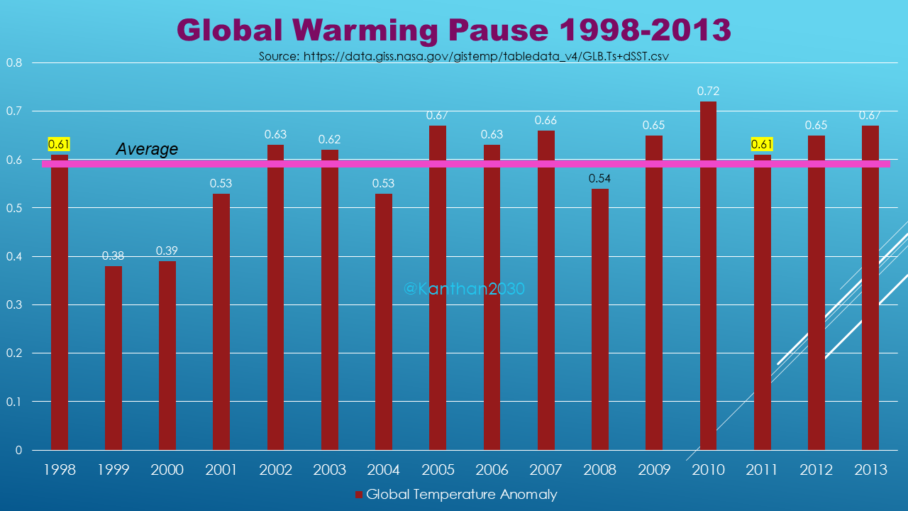
Here, again, you see how temperature in 1998 was the same as in 2011. During those thirteen years, the world’s GDP grew a whopping 150%. However, despite all the evil CO2, the earth remained calm and cool. This alone disproves their simplistic CO2 hypothesis.
Different people have different ranges for the global warming pause. Here is one that sees a 19-year pause from 1995-2014:

So, this is statistics, and thus there is subjectivity. However, the bottom line is that there was a huge global warming pause.
However, go back to NASA’s scary chart (Figure 1) and you will see no pause! Absolute scientific fraud.
2015-2022: Global Cooling!
The embarrassment continue for climate jihadists. The last 8 years have been cooling!

What’s the explanation? Nothing. Again, the standard fake excuse without any evidence: “The ocean ate my lunch, that is, heat.”
Put Them All Together
Okay, we have three periods. Period 1 with very little warming, Period 2 with no warming, and Period 3 with cooling. If you add them all up… how the heck can you get 40 years of terrible warming that scares the hell out of the world?
It’s as if we live in the Dark Ages when peasants will believe whatever the Emperor and the Pope says. The priests of the old days are now the pay-for-play “scientists.”
Actual Temperature, Not Anomaly
By the way, have you noticed how the climate scammers always show you charts of “anomaly.” Why don’t they just show the ACTUAL earth’s temperature? Here’s why. It would scare no one! Here is the global temperature (not anomaly) from 1980-2022.

Globalists cannot force the great reset with a chart like the one above.
Conclusion
Terrible climate change and global warming seem plausible only because of extensive propaganda. Every bad weather event is turned into a proof for dangerous climate change caused by humans and CO2.
Climate scientists are like astrologers, who will tell you confidently stuff like, “Scorpios are jealous.” If you believe in it, you will start seeing a lot of jealous Scorpio people!
The climate cult also uses circular reasoning:
- “Climate change is real because of the trend.”
- “The trend is real because of climate change.”
You cannot argue with these people because they cannot think logically. Charts and data won’t change the minds of these people.
And they won’t acknowledge that the data is rigged. Or worse, they will justify it! One person told me, “Yeah, it’s good that they adjusted the data to reveal global warming!”
There is no hope with these people. LOL.
Hopefully, you are one of those readers who is rational and can think critically.
— Chris Kanthan, Jan 2023.
Related Blog Posts:

Well said is all I have to say really! These ECO Freaks should focus on what has & is being done by us technocrats!!!
LikeLike
So sad that you discredit your otherwise remarkable and important work with such crap
LikeLike
You’re just as propagandized as others. Your choice of brainwashing is different. That’s all. LOL.
LikeLiked by 1 person